15 Spring Wedding Color Palettes That Feel Fresh and Real
Spring weddings offer a unique opportunity to blend vibrant blooms with natural light, but finding the right balance between color and clarity is key. Rather than chasing fleeting trends, consider how specific hues interact with your venue’s architecture and lighting conditions. This collection of fifteen palettes moves beyond generic pastels, offering concrete combinations that work for everything from intimate backyard ceremonies to larger banquet hall receptions. Each idea focuses on realistic floral availability, appropriate tablescaping, and practical setup considerations. Whether you prefer the crisp contrast of sky blue and white or the earthy warmth of terracotta and olive, these styles provide a clear visual direction. Use them as a starting point to adapt colors and materials to your specific budget, venue constraints, and personal aesthetic preferences.
1. Blush Pink and Eucalyptus
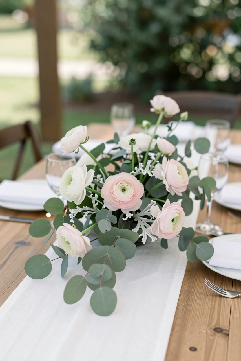
Blush pink and eucalyptus creates a balanced spring palette by pairing soft, warm petals with cool, silvery greenery. This combination prevents the setup from appearing overly sweet, relying on the muted tones of dusty rose ranunculus to provide gentle color contrast against the matte texture of silver dollar eucalyptus. To ground the airy aesthetic, layer white linen runners over natural wood or neutral tableware. The visual weight remains low and breathable, making it ideal for bright garden venues or light-filled reception spaces. For a cohesive look, extend the palette to stationery using blush ink on cream cardstock and select dinnerware in matte white or pale stone. Keep centerpiece heights moderate to maintain clear sightlines across the table, allowing guests to see each other while enjoying the floral arrangement. This approach works best when you prioritize texture over volume, using the natural shape of the stems rather than dense, packed blooms.
2. Lemonade and Mint Greenery
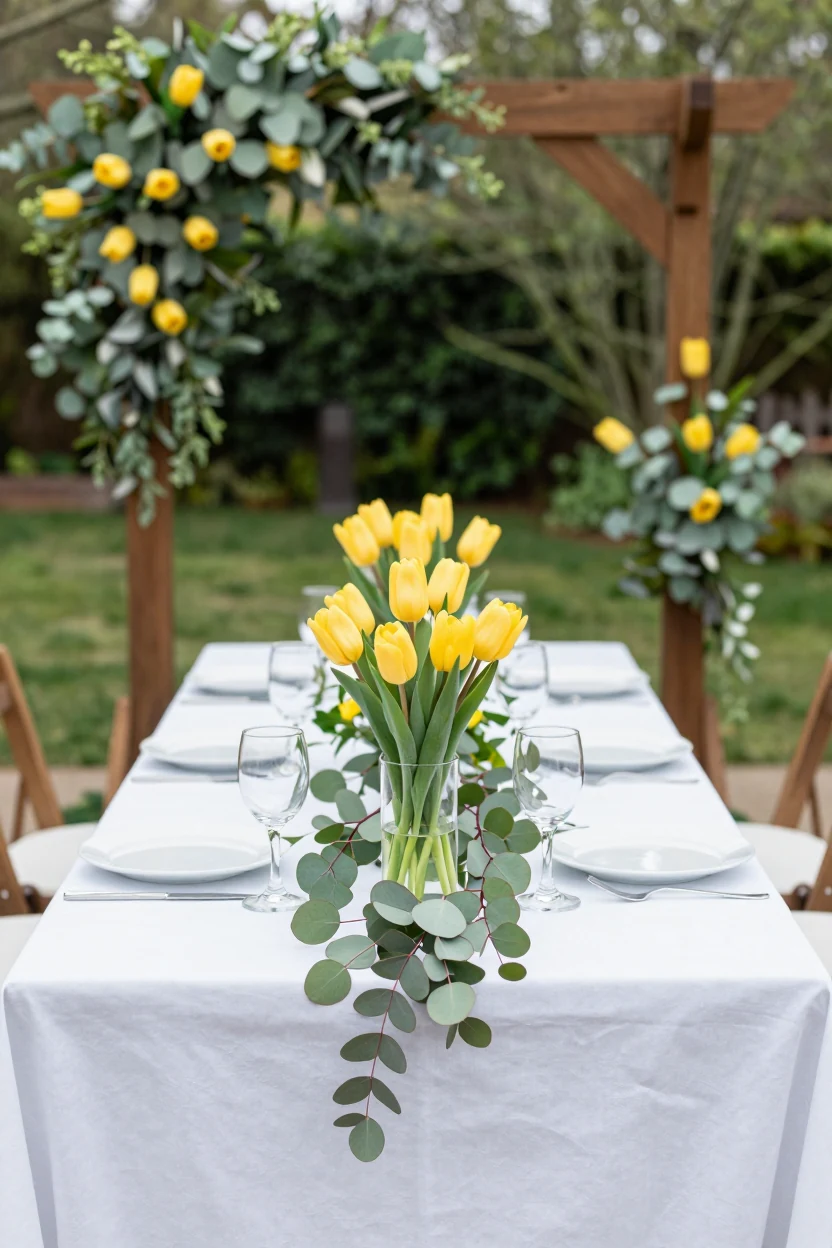
This daytime palette pairs bright yellow tulips with crisp mint-green foliage for a high-energy look. The visual impact relies on the contrast between cheerful yellow blooms and a cool, fresh green backdrop. In a realistic setup, imagine long rectangular tables draped in plain white linen to keep the focus on the florals. Low centerpieces feature clusters of yellow tulips interspersed with trailing mint greenery like silver dollar eucalyptus or young boxwood. The greenery extends slightly over the table edges, creating a sense of movement without blocking guest sightlines. Simple clear glassware and minimal white plates prevent the table from feeling cluttered. For the ceremony, a simple wooden arch draped in the same mint foliage anchors the space, with yellow tulips placed at the base rather than in hanging installations. This setup works best in open-air venues where natural light enhances the zesty tones. If tulips are not in peak season or availability is limited, bright yellow ranunculus or daffodils offer a similar color impact while maintaining the springtime feel.
3. Powder Blue and Cream
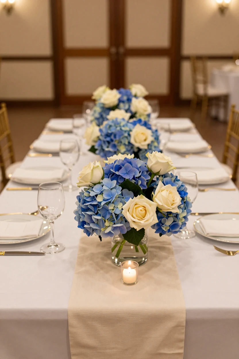
This muted combination relies on tonal contrast rather than high saturation. Soft powder blue hydrangeas provide volume and a cool base, while warm cream roses in the foreground add necessary depth to prevent the table from looking stark. The palette works well in banquet halls where lighting can wash out delicate shades; the cream tones anchor the visual weight. Use textured linen runners to break up flat surfaces and add tactile interest. Keep the floral arrangement low and wide, ensuring guests can maintain eye contact across the table. This setup is adaptable for semi-formal events, offering a sophisticated alternative to traditional white or red schemes without feeling overly casual.
4. Lavender and Silver Eucalyptus
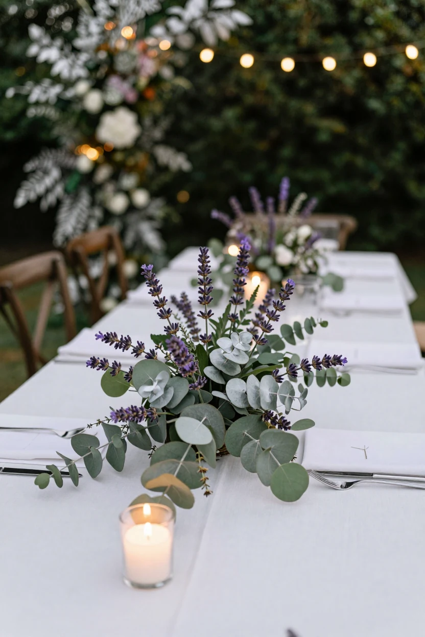
This cool-toned palette pairs soft lavender salvia or statice with the matte, silver-green leaves of eucalyptus. The combination works best in dimmer settings where warm string lights or candlelight reflect off the metallic sheen of the foliage. Style the table with crisp white linen and simple glassware to keep the focus on the textured florals. Use a low, sprawling centerpiece rather than tall stems to maintain clear sightlines across the room. For the bouquet, cluster the lavender tightly around the wrists to create a dense, hand-tied look. The silver tone of the eucalyptus acts as a neutral bridge between the violet blooms and any white or cream accents in the venue. This setup feels grounded and modern, avoiding the overly saturated look of bright purple flowers while retaining a distinct springtime freshness.
5. Coral and Deep Teal
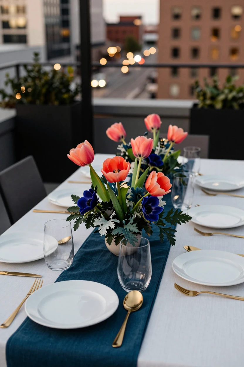
Coral and deep teal create a high-contrast, modern look that feels bold without being overwhelming. This palette works best in urban or rooftop settings where architectural lines provide a neutral backdrop. Use warm coral tulips or anemones as the primary floral element to inject softness against the cool, saturated green of dusty miller or maidenhair ferns. For table settings, pair matte white dinnerware with deep teal linen runners and coral napkins. Low-profile centerpieces keep sightlines open, allowing the color blocking to take center stage. Incorporate texture through brushed metal cutlery and glassware to bridge the gap between the warm and cool tones. This combination suits contemporary couples who want a vibrant, gallery-like aesthetic rather than a traditional floral display. The depth of the teal grounds the space, preventing the coral from looking too bright under evening lighting.
6. White and Sage Green
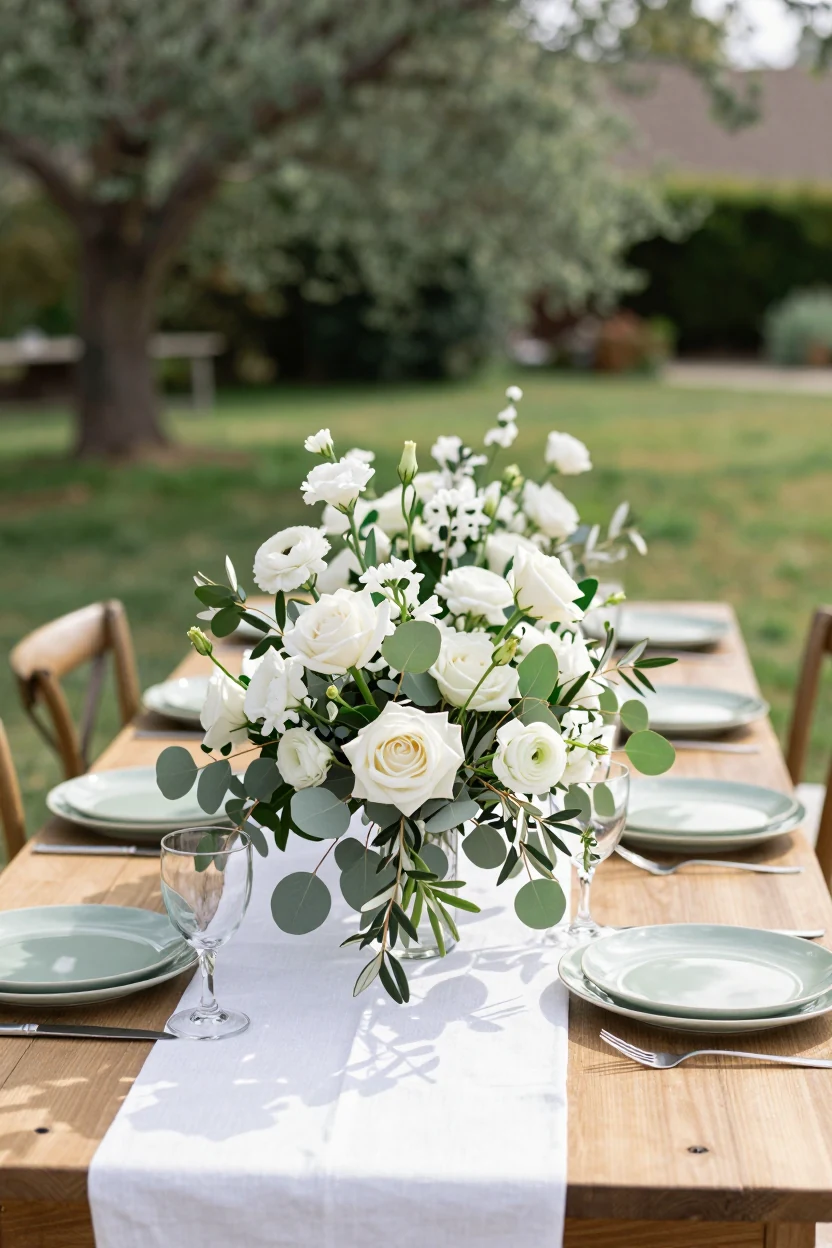
This palette relies on tonal variation rather than contrast to create depth. Layer white blooms like garden roses, lisianthus, and ranunculus with substantial amounts of sage greenery such as silver dollar eucalyptus and olive branches. The mix of matte petals and textured leaves prevents the light scheme from appearing flat or washed out. For tablescapes, use crisp white linens paired with sage-hued ceramic dinnerware to keep the focus on the floral arrangement. Low, sprawling centerpieces allow for eye contact across long tables, while taller arrangements can be reserved for the head table. Incorporate natural wood chairs and unadorned glassware to maintain an organic, rustic-chic feel. This look works well in backyard settings where natural light enhances the softness of the colors. If white feels too stark, swap in ivory napkins to warm up the overall temperature. The result is a clean, airy aesthetic that feels grounded and sophisticated without requiring expensive structural elements.
7. Peach and Dusty Blue
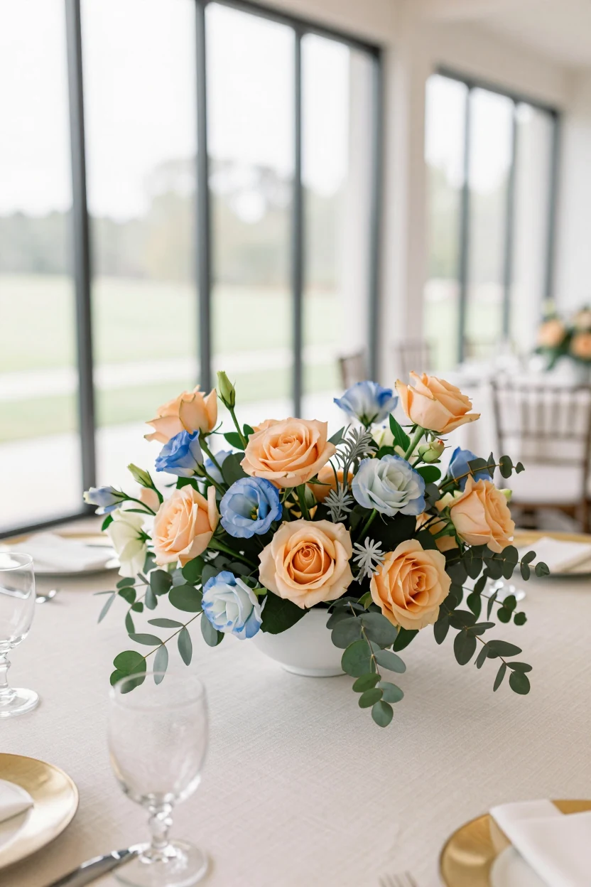
Peach and dusty blue create a harmonious, soothing atmosphere by leveraging their analogous relationship on the color wheel. This palette feels distinctly springtime, blending warm peachy tones with cool, muted blues for a dreamy yet grounded aesthetic. The setup thrives in bright, indoor spaces with large windows, where natural light enhances the softness of the colors without washing them out. Garden roses in varying shades of apricot and coral provide textural contrast against the delicate, star-shaped blooms of dusty blue lisianthus. This combination works well for both ceremony arches and reception centerpieces, offering a romantic alternative to traditional white or red florals. The muted nature of the blue prevents the peach from appearing overly warm, while the peach keeps the blue from feeling too cold. This balance makes it versatile for various venues, from modern lofts to classic ballrooms. By keeping the greenery minimal and light, such as silver dollar eucalyptus, the focus remains on the interplay between the two primary hues.
8. Butter Yellow and Charcoal
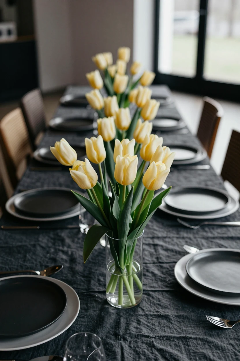
This palette swaps traditional pastels for a sleeker contrast. Pale butter yellow tulips provide a soft spring accent against deep charcoal linens, creating visual weight without feeling heavy. The dark fabric grounds the lightness of the flowers, making the yellow pop with modern energy. For a realistic setup, use long-stemmed tulips in low, wide glass vases to keep sightlines open for guests. Pair this with matte black or slate grey dinnerware and white charger plates to frame the table. Charcoal velvet or heavy cotton table runners add texture against smooth porcelain. Avoid over-accessorizing; let the color contrast do the work. This look works well in barns, industrial lofts, or garden pavilons where natural light highlights the yellow petals. If full charcoal feels too intense for a daytime ceremony, substitute with navy blue linens and keep the yellow floral accents consistent across bouquets and centerpieces.
9. Rose Quartz and Oat Milk
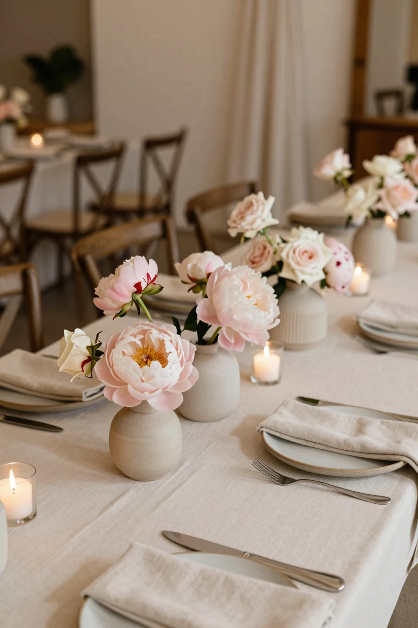
This palette swaps bright spring hues for a soft, tonal approach using rose quartz and warm oat milk neutrals. It creates a cozy, sophisticated atmosphere ideal for boutique hotels or intimate venues. The lack of vibrant greenery keeps the focus on the delicate textures of the blooms and natural materials. To recreate this look, pair soft pink peonies or garden roses with unglazed, matte ceramic dinnerware in beige tones. Layer oat-colored linen napkins over cream tablecloths to add depth without introducing new colors. Use low, clustered votive candles rather than tall candelabras to maintain an intimate scale and ensure safe clearance. For the bouquet, keep the structure loose and organic, allowing the petals to overlap naturally. This setup works well for spring or early fall weddings where a muted, earthy aesthetic is preferred. The warm neutrals ground the pink, preventing it from feeling saccharine while maintaining a romantic, grounded feel.
10. Sky Blue and White
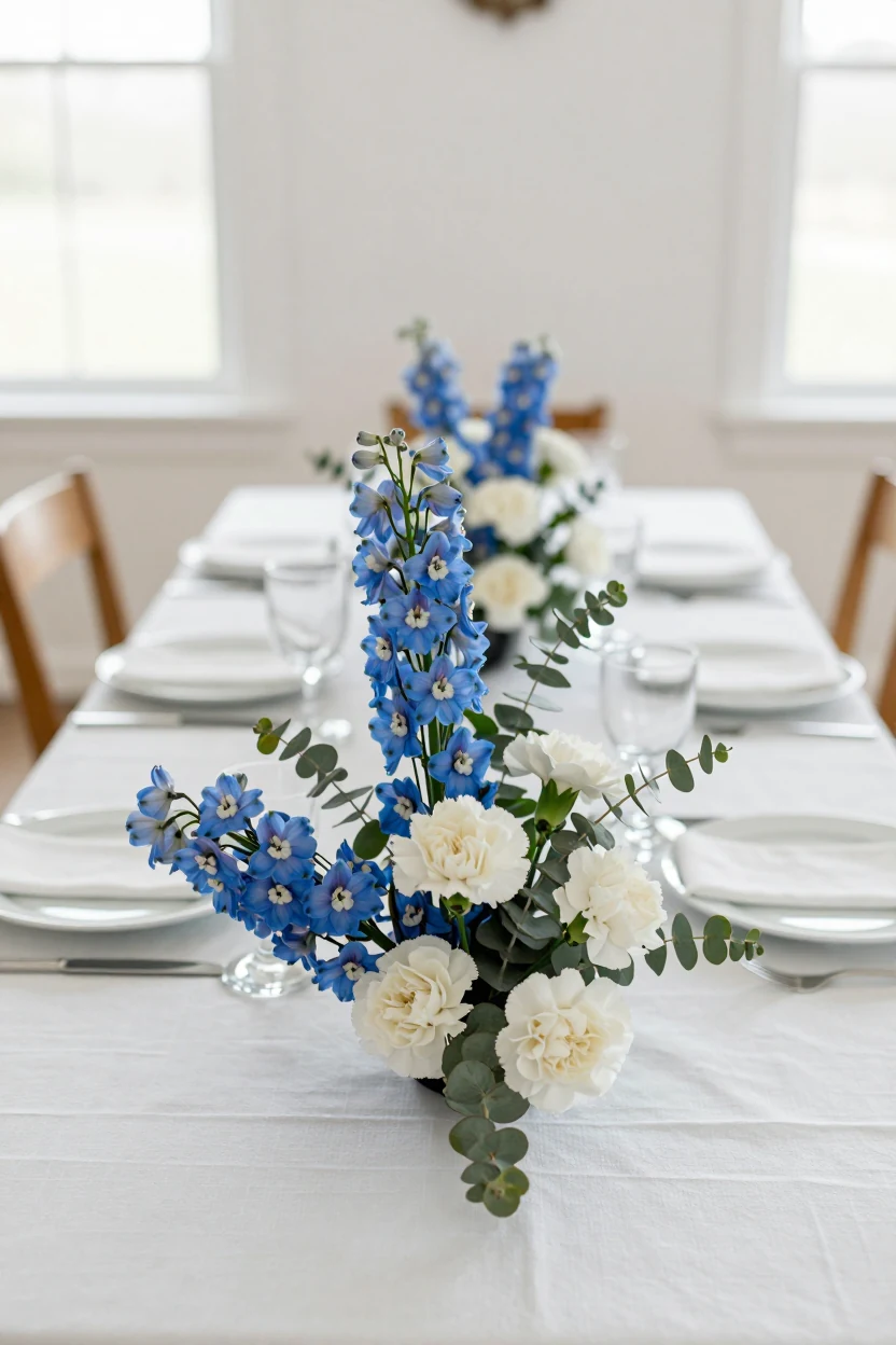
This crisp palette pairs the vivid, cool tone of sky blue with stark white to create a clean, high-contrast visual impression ideal for mid-spring weddings when the air is still clear. The look relies on simplicity and clarity rather than heavy ornamentation. For the table setting, use crisp white linen napkins and simple clear glassware to let the floral colors pop without distraction. Delphiniums provide the primary blue element due to their tall, airy stems, while white carnations or roses add texture and volume. Keep greenery minimal; a few sprigs of silver dollar eucalyptus can bridge the gap between the flowers and the table without introducing competing greens. The stationery should feature a simple sans-serif typeface on uncoated white paper with a single sky blue border or seal to maintain the modern, uncluttered aesthetic. This combination works best in venues with natural light, such as a bright indoor hall or an outdoor gazebo, where the cool tones reflect the daylight.
11. Pistachio Green and Blush
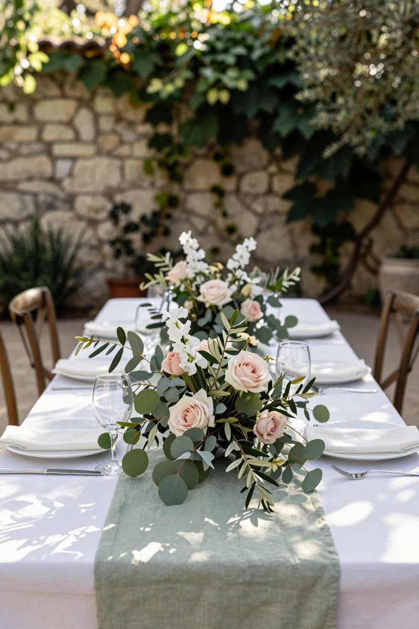
Pistachio green and blush creates a fresh, botanical look where foliage takes center stage. This palette pairs soft pink blooms with abundant green leaves, making it ideal for garden or patio settings. The green acts as the primary color, providing a natural backdrop that makes the pink feel subtle rather than loud. For floral arrangements, use eucalyptus, olive branches, or sweet pea vines to establish the green base. Keep centerpiece heights low so guests can see each other across long rectangular tables. Choose satin or cotton linens in pale sage or off-white to let the florals stand out. If using candles, place them in glass jars on low risers to ensure safety and clear sightlines. This setup works best during late spring when natural light is bright and shadows are soft. Adapt the concept by swapping pink peonies for white tulips if you want a cleaner look, or by using greenery alone for a minimalist arrangement.
12. Terracotta and Olive
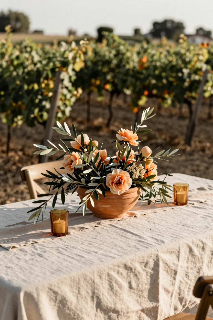
This earthy palette swaps typical cool spring tones for warmth, pairing terracotta ceramics with olive-green foliage for a grounded Mediterranean feel. The look suits late-spring weddings in vineyards or rustic estates where natural light highlights the texture of clay and leaves. Use unglazed terracotta pots as centerpieces filled with loose sprigs of olive branches, eucalyptus, and seasonal blooms like ranunculus or peonies in muted apricot tones. Layer linen napkins in sand or sage over simple white dinnerware to keep the table relaxed but intentional. Add height with a few amber glass votives containing beeswax candles, ensuring they sit securely on flat surfaces away from flammable materials. The visual impact comes from the contrast between the matte finish of the clay and the soft sheen of the leaves. This setup works well for both ceremony backdrops and reception tables, offering a sophisticated alternative to pastel-heavy spring themes.
13. Ivory and Dusty Rose
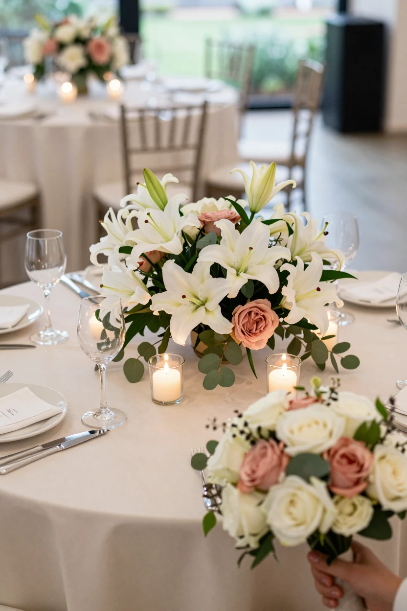
Ivory and dusty rose create a muted, vintage-inspired palette that balances softness with structural elegance. The visual anchor is a mix of large, creamy lilies or garden roses paired with the delicate, ruffled petals of dusty rose peonies. This combination works because the heavy texture of the lilies grounds the lighter, airier peonies, preventing the table from looking overly delicate. Use crisp white or champagne linens to keep the base clean, allowing the floral tones to provide all the color interest. Incorporate clear glassware and simple gold flatware to maintain a refined look without introducing competing metallics. For a cohesive setup, place low, sprawling arrangements in the center of round tables, interspersed with pillar candles for warm, ambient lighting. This palette adapts easily to various venues, from garden pavilions to ballrooms. It suits couples who want a romantic aesthetic that feels grounded rather than whimsical. You can adjust the intensity by increasing the ratio of ivory blooms for a brighter look or adding more peonies for a deeper, rosy tone.
14. Mint Green and White
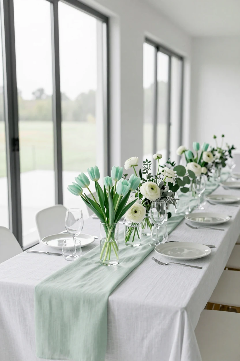
This palette pairs the cool, calming hue of mint green with crisp white to create a spa-like atmosphere that feels distinct from traditional spring florals. The visual impact relies on low-contrast tonal harmony rather than bold color blocking. For floral arrangements, use mint green tulips or lisianthus as the primary bloom, supported by white ranunculus and delicate sprigs of silver dollar eucalyptus to maintain an airy structure. Avoid heavy, dark foliage that might muddy the lightness of the scheme. On the table, layer a crisp white linen with a subtle textured runner in a pale sage or mint shade to anchor the color without overwhelming the space. Choose clear glassware and simple ceramic dinnerware in off-white or light gray to keep the focus on the floral elements. The lighting should be bright and natural, emphasizing the freshness of the green tones. This setup works well for modern venues with large windows or outdoor gardens where natural light can enhance the pastel hues. For a cohesive look, extend these colors to your stationery using mint ink or watercolor washes on white card stock.
15. Soft Lavender and Gold
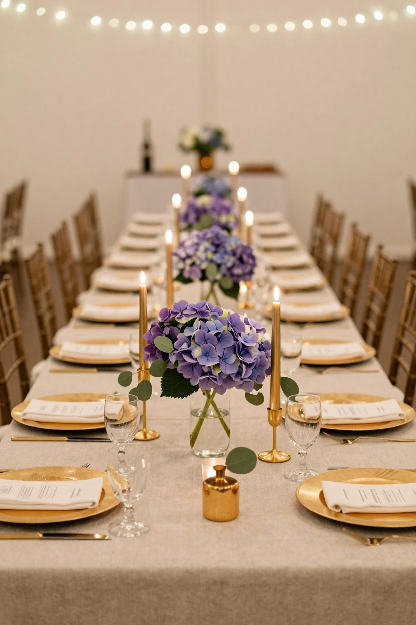
Lavender and gold create a sophisticated contrast, pairing cool floral tones with warm metallic accents for an evening spring reception. This palette works best when the gold is restrained, appearing in candlesticks, charger plates, or thin vase stems rather than large surface areas. Lavender hydrangeas, lisianthus, or sweet pea provide the primary color, while silver dollar eucalyptus adds texture without competing for attention. The visual balance relies on the matte finish of the flowers against the reflective quality of the gold elements. For a realistic setup, place low centerpieces on long rectangular tables to maintain sightlines, using taper candles in slender gold holders. Linens should be neutral, such as ivory or cream, to allow the colors to stand out. This combination feels regal without being overly formal, making it suitable for vineyard venues or ballrooms with warm ambient lighting.
Choosing Your Spring Palette
Selecting the right spring palette depends on how you want your guests to feel in the space. Consider the natural light in your venue; bright outdoor settings often support lighter tones like powder blue or white, while dimmer indoor spaces may benefit from the grounding contrast of charcoal or deep teal. Think about the texture you want to emphasize, whether it is the matte finish of eucalyptus or the reflective quality of gold accents. Adapt these ideas by swapping seasonal blooms for locally available alternatives and adjusting tablescaping to fit your budget. The goal is a cohesive look that feels intentional and comfortable, not just decorative.
