12 Red Wedding Color Palette Ideas Beyond the Obvious
Red is a bold choice for a wedding palette, but it does not have to mean traditional crimson roses with gold accents. This collection explores how to integrate red through diverse textures, tones, and settings, from the plush depth of burgundy velvet chairs to the raw character of exposed brick. Each idea focuses on practical application, considering factors like venue architecture, seasonal lighting, and furniture materials. Whether you are planning a formal ballroom reception or a relaxed backyard ceremony, these concepts demonstrate how to use red as a grounding anchor or a vibrant accent. By focusing on specific material pairings and realistic setups, you can adapt these looks to fit your budget and style while maintaining a cohesive visual narrative throughout the event.
1. Crimson Tulip Tablescapes with Matte Black Ceramic
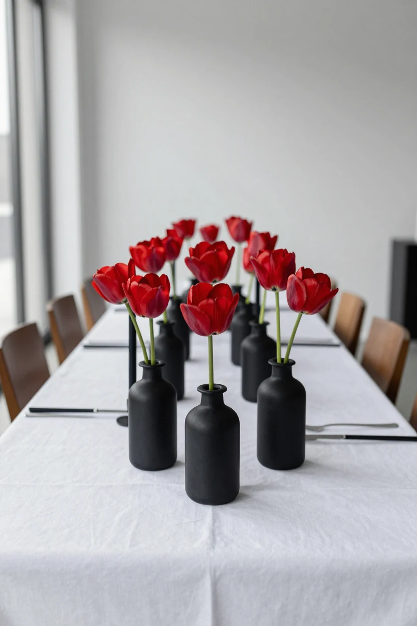
This tablescape achieves a striking, modern aesthetic by pairing the organic curvature of crimson tulips with the rigid geometry of matte black ceramic vessels. The high contrast between the deep red blooms and the stark black cylinders creates a graphic visual impact that feels contemporary and intentional. A crisp white linen tablecloth serves as a neutral canvas, allowing the bold color blocking to stand out without needing metallic accents or busy patterns. Black taper candles in matching matte holders add vertical dimension while maintaining the monochromatic discipline of the palette. The setup works best on rectangular tables where long rows of tulips can create a continuous line of color. This style suits urban venues, hotel ballrooms, or any space with clean architectural lines. To adapt this look, focus on texture contrast: the soft petals against the smooth, non-reflective ceramic. Keep dinnerware simple—white plates or clear glass—to avoid competing with the floral arrangement. This approach relies on negative space and precise placement rather than volume, making it visually striking yet manageable for a standard reception layout.
2. Burgundy Velvet Ceremony Chairs with Cream Linen Draping
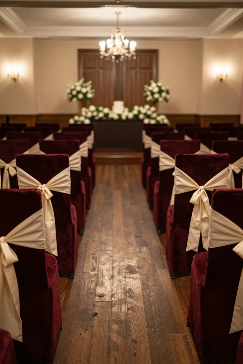
Deep burgundy velvet chairs anchor this formal indoor ceremony, creating a rich visual corridor that defines the space without relying on heavy floral arches. Each chair features a simple cream linen sash tied at the back, introducing a soft, matte texture that contrasts with the plush upholstery. The combination grounds the red tones, preventing them from feeling overly saturated or aggressive in a dimly lit ballroom or church setting. This setup works particularly well for fall or winter weddings where warm, low lighting enhances the depth of the fabric. To recreate this look, select high-density velvet chairs in a wine or oxblood shade and source lightweight linen or cotton-blend sashes in ivory or soft cream. Keep the aisle clear by ensuring chair arms do not protrude too far into the walking path. For a variation, swap the linen for satin ribbons if you want a slight sheen that catches candlelight, or add small eucalyptus sprigs tucked into the chair ties for a subtle organic element.
3. Rustic Terracotta and Burnt Orange Backyard Setup
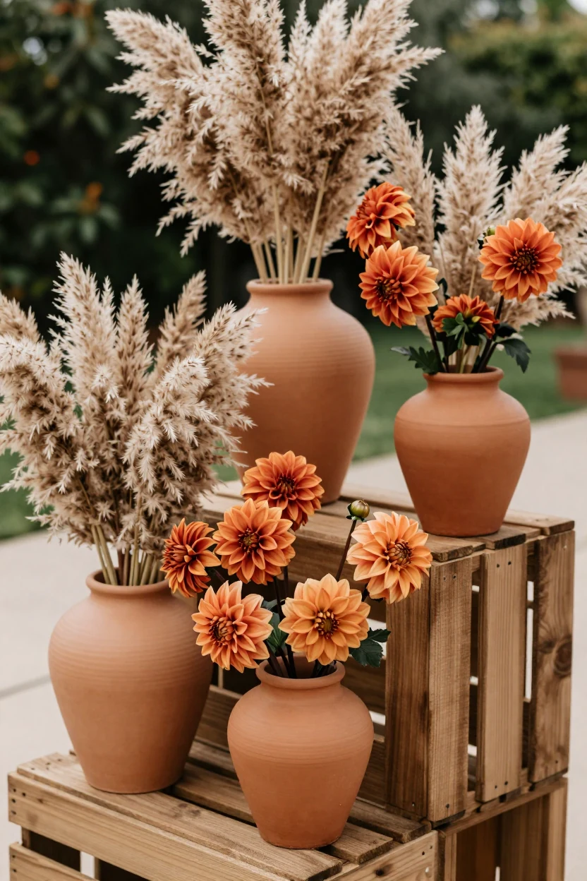
This setup reinterprets red through earthy tones like terracotta and burnt orange, ideal for a relaxed backyard wedding. The focal point features rustic wooden crates stacked to create a tiered display of matte clay pots. Each pot holds a mix of dried pampas grass and vibrant burnt orange dahlias, creating a textured contrast between dry and fresh elements. The natural materials avoid glossy finishes, keeping the aesthetic grounded and organic. This palette complements outdoor lighting as the sun sets, casting warm hues that enhance the depth of the colors without appearing overly polished. The arrangement is suitable for a ceremony backdrop or reception entryway. To adapt this concept, source matte clay vessels in varying sizes to ensure visual rhythm. Keep the greenery minimal to let the floral colors stand out. This style works best with simple linen textiles and wooden furniture, ensuring the decor remains the star of the scene.
4. Minimalist Red Paper Goods and Black Typography
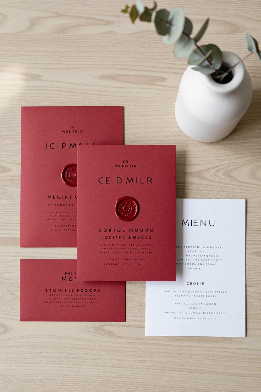
This stationery suite relies on high-contrast typography and tactile paper textures rather than floral volume. Deep red cardstock serves as the base for save-the-dates, invitations, and menu cards, paired with crisp black sans-serif type for clarity. A single red wax seal provides a cohesive finishing touch without adding visual noise. The design travels well, allowing guests to see the same aesthetic in their pocket cards as they do on the welcome table. For the venue, keep physical decor minimal to let the paper goods stand out. Use simple white or cream linens and clear glassware so the red invitations remain the focal point when displayed in small acrylic stands or wooden trays. This approach works for modern, gallery-style venues where clean lines are preferred over heavy drapery. It is a restrained way to introduce bold color while maintaining a sophisticated, editorial feel throughout the event.
5. Cherry Red Garden Centerpieces with Silver Accents
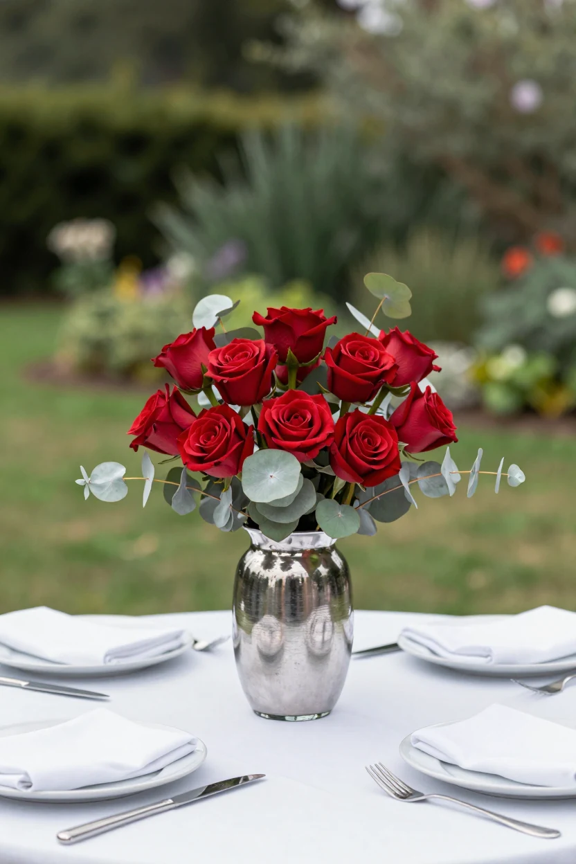
Cherry red garden roses paired with silver dollar eucalyptus offer a fresh, modern alternative to traditional gold and crimson pairings. This low-slung centerpiece design uses brushed silver glass vases to reflect natural daylight, creating a cool-toned aesthetic that thrives in bright, open-air garden venues. The composition keeps the floral height under twelve inches, ensuring clear sightlines for guests seated across the table. Surround the arrangement with crisp white linen napkins and matte white dinnerware to let the saturated red petals and metallic silver leaves stand out. For lighting, rely on ambient daylight or discreet uplights rather than warm candlelight, which can muddy the cool silver tones. This setup works well for spring or early summer weddings where you want a vibrant look that feels crisp rather than heavy. If cherry roses are unavailable, consider using red lisianthus or peonies as seasonal substitutes to maintain the rounded bloom shape. The contrast between the organic floral texture and the sleek metallic finish provides visual interest without requiring excessive decor.
6. Dark Red Brick and Greenery Industrial Reception
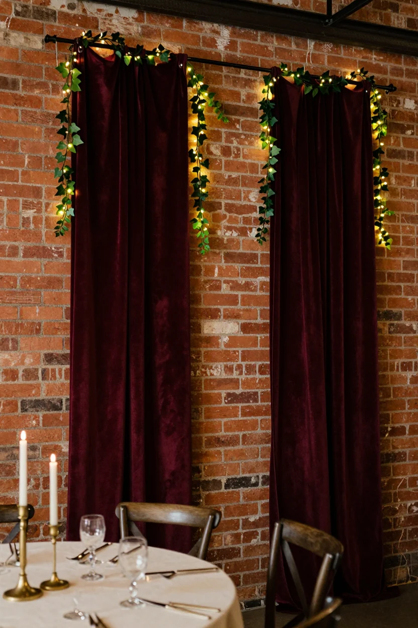
This industrial loft concept leverages existing architectural character rather than relying on heavy freestanding structures. Exposed red brick walls serve as the primary backdrop, paired with deep burgundy velvet drapery that hangs from ceiling hooks. The rough, porous texture of the masonry contrasts sharply with the soft, light-absorbing quality of the heavy fabric. Trailing ivy vines drape loosely over the curtain edges, introducing organic green tones that soften the hard edges of the space. Warm string lights are woven through the foliage, providing low-level ambient illumination without overpowering the room's natural shadows. The setup creates a cozy, intimate focal point for the head table or entrance area. Because it utilizes the venue’s inherent structure, this approach requires minimal installation time and avoids blocking sightlines or emergency exits. It works best in spaces with high ceilings and open floor plans where guests can gather closely around the illuminated wall.
7. Blush Red and White Floral Cloud Chandelier
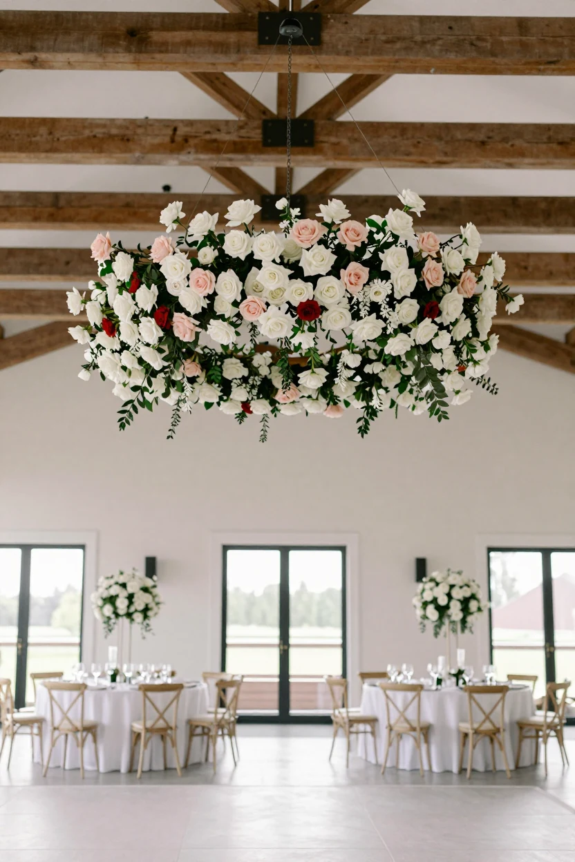
Suspend a circular floral arrangement above the dance floor to create an overhead focal point without blocking table views. This installation features dense clusters of white roses, blush garden roses, and delicate sprays of baby’s breath, interspersed with small red carnations for subtle contrast. The structure is mounted securely to ceiling beams using professional rigging, ensuring stability and safe clearance above guests. Below, the dance floor remains clear, allowing sightlines to the stage or DJ area. The soft pastel palette diffuses harsh overhead lighting, creating a warm, ambient glow that complements the venue’s architecture. This approach works well in ballrooms or barns with high ceilings, where traditional ceiling fixtures might feel industrial. For a more grounded look, pair the hanging flowers with simple white linens and low-profile centerpieces on the tables. Avoid placing candles directly beneath the installation to prevent heat exposure. This setup provides a dramatic yet airy atmosphere, shifting focus upward while maintaining a clean, uncluttered floor plan for easy movement and photography.
8. Scarlet and Navy Holiday Table Setting
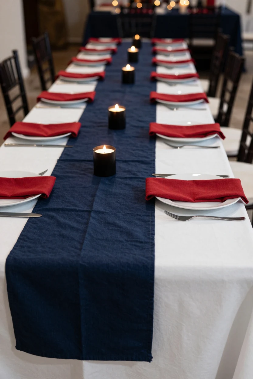
Swap traditional greenery for deep navy linens to create a sophisticated winter palette that feels distinct from standard holiday decor. This formal dining setup pairs scarlet red cloth napkins with crisp white dinner plates and matte black flatware, using navy runners as the grounding base. The contrast is sharp and modern, relying on textile texture rather than heavy floral displays. Place cards in a clean sans-serif font sit atop the red napkins, maintaining visual clarity. Low-profile taper candles in black glass holders provide warm, flickering light without obstructing sightlines across the table. This arrangement works well for December receptions or New Year’s Eve celebrations where guests expect a festive but refined atmosphere. The navy prevents the red from feeling overly traditional, introducing a nautical or midnight vibe. For adaptation, consider swapping the runner for a textured wool throw if the venue is rustic, or using burgundy napkins to soften the intensity of scarlet against the dark blue background.
9. Dried Red Poppy Meadow Aisle
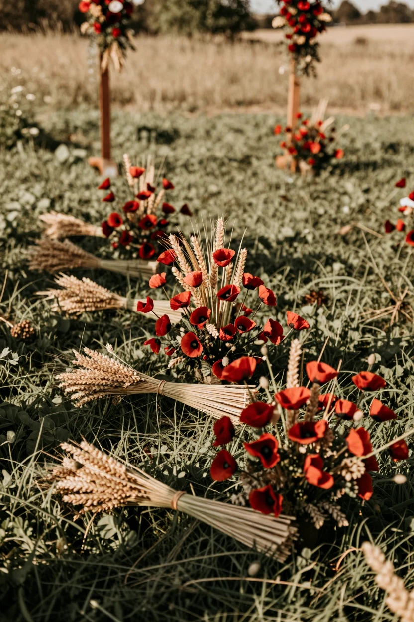
This aisle design replaces traditional floral runners with clusters of dried red poppies and golden wheat stalks, creating a rugged yet romantic path through an open field. The dried nature of the blooms provides structural integrity against wind, ensuring the arrangement remains stable without heavy bases that might damage the grass. Place these bundles at regular intervals along the ceremony aisle, securing them with low-profile stakes to keep guest circulation clear and safe. The palette pairs deep crimson petals with warm straw tones and muted green stems, offering a textural contrast to smooth fresh flowers. This setup suits bohemian or rustic weddings where the natural environment is part of the aesthetic. For adaptation, pair this aisle style with linen-draped chairs and simple wooden signage to maintain an organic feel. If local regulations restrict dried goods outdoors, consider high-quality artificial alternatives that mimic the matte finish. The look is intentionally imperfect, embracing the wildness of a meadow setting while providing a clear, inviting path for the couple.
10. Red Leather Bar Stools and Brass Hardware
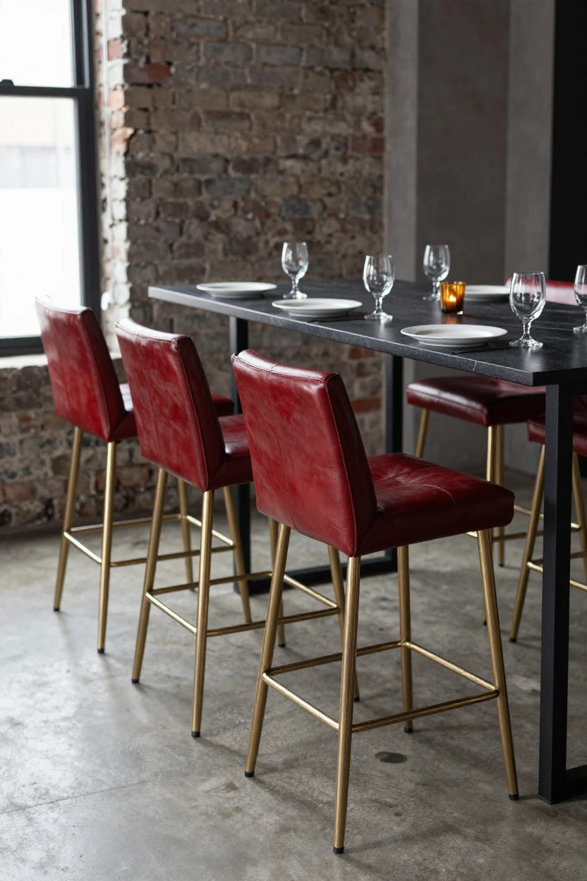
Swap traditional banquet chairs for custom red leather bar stools with brass legs to create a lounge-style reception atmosphere. This setup works best at a head table, bar area, or cocktail lounge where guests can sit slightly higher than standard dining seating. The deep red upholstery provides a bold visual anchor, while the polished brass hardware adds industrial warmth without feeling cold. Pair this seating with a dark walnut or black marble table surface to ground the brightness of the leather. Keep the surrounding decor minimal to let the furniture speak; use simple white ceramic plates and unadorned glassware rather than heavy place settings. If the venue has exposed brick or concrete floors, the look integrates naturally. For a softer approach, add sheer linen runners in a neutral tone to break up the hard lines of the metal legs. This concept is particularly effective for urban lofts, warehouse spaces, or modern barns where the architecture already features raw materials. It offers a distinct alternative to upholstered dining chairs while maintaining a sophisticated, contemporary aesthetic.
11. Watercolor Red and Grey Invitations
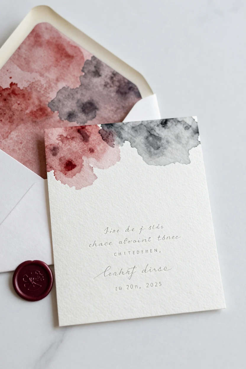
This invitation suite uses watercolor washes to soften the intensity of red, blending it with cool grey on heavy cotton paper. The artistic approach allows couples to incorporate the palette without the visual weight of solid crimson backgrounds. The design features loose, hand-painted blooms or abstract shapes that bleed gently into the margins, creating an organic feel against the crisp white space. Typography remains clean and modern in charcoal or black serif fonts to maintain readability against the painted textures. This stationery works best when paired with a neutral venue, such as a white-walled gallery or light wood barn, allowing the paper goods to serve as the primary color carrier. Guests receive the invitation suite first, setting the tone for a restrained, artistic celebration. The watercolor technique suggests a relaxed yet refined aesthetic, suitable for spring or summer weddings where the colors feel fresh rather than heavy. It is an effective way to introduce red into the wedding design language while maintaining a sophisticated, gallery-like atmosphere.
12. Red Neon Sign and Dark Wood Backdrop
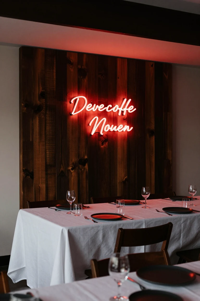
Swap traditional floral walls for a luminous focal point by mounting a custom red neon sign against dark reclaimed wood panels. This modern, nightlife-inspired aesthetic works best in low-light evening receptions where the glow interacts with the wood grain to create dynamic ambient lighting. The setup serves as a striking backdrop behind the sweetheart table, shifting the focus from fabric and petals to light and texture. Keep the surrounding table styling minimal to let the installation breathe; use matte black or dark walnut chairs with simple white linen napkins to maintain contrast. If your venue has strict electrical codes, consult a licensed professional for safe mounting and wiring rather than attempting a DIY installation. This look suits contemporary couples who want a moody, sophisticated atmosphere. For a softer variation, choose a script font instead of block letters, or select a deeper crimson shade to complement burgundy accents elsewhere in the decor.
Selecting Your Red Palette Strategy
Choosing the right red palette depends on how you want the color to interact with your venue’s existing architecture and lighting. A modern loft may suit the industrial brick and neon options, while a garden setting pairs well with soft watercolor invitations and silver accents. Consider the season: deep burgundy velvet works best in cooler months, whereas terracotta tones shine in late summer warmth. Assess your setup complexity too; paper goods require minimal installation, while overhead floral installations need professional rigging. Select the idea that aligns with your comfort level for DIY versus vendor support, ensuring the final look feels intentional and achievable.
